 The project proposes an alternative way to deal with the changing countryside of Groningen, the Netherlands. Instead of conserving the old, the proposal embraces new changes on the countryside to enrich the existing qualities of the landscape. The project consists of three equal big volumes, whose scale is put in relation to the big polder. In doing so the volumes can be experienced big and small simultaneously. By structuring all volumes introvert, the outer façade could be totally devoted to the surrounding landscape.
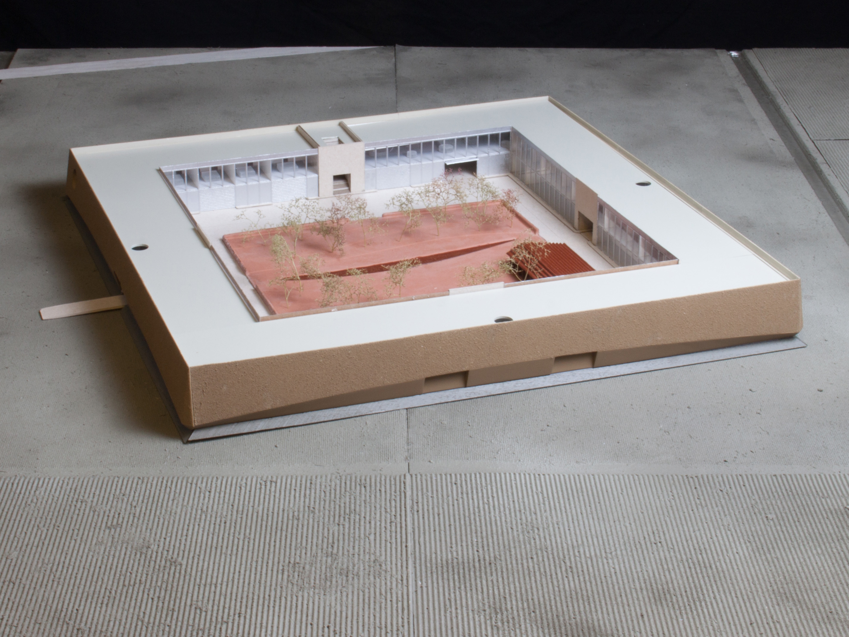
To summarize it was important to show the relation between the building and the polder landscape in my final model. Colour and tactility played an important role in this relation and I will therefore elaborate on both aspects. The model shown here is a 1:200 scale model with a size of 1400mm square.
Colour
To emphasize the relationship between the building and the landscape I decided to use realistic colours. To make a proper colour palette it is important to make multiple tests to see how the colour looks on the material and to see how all colours fit each other.
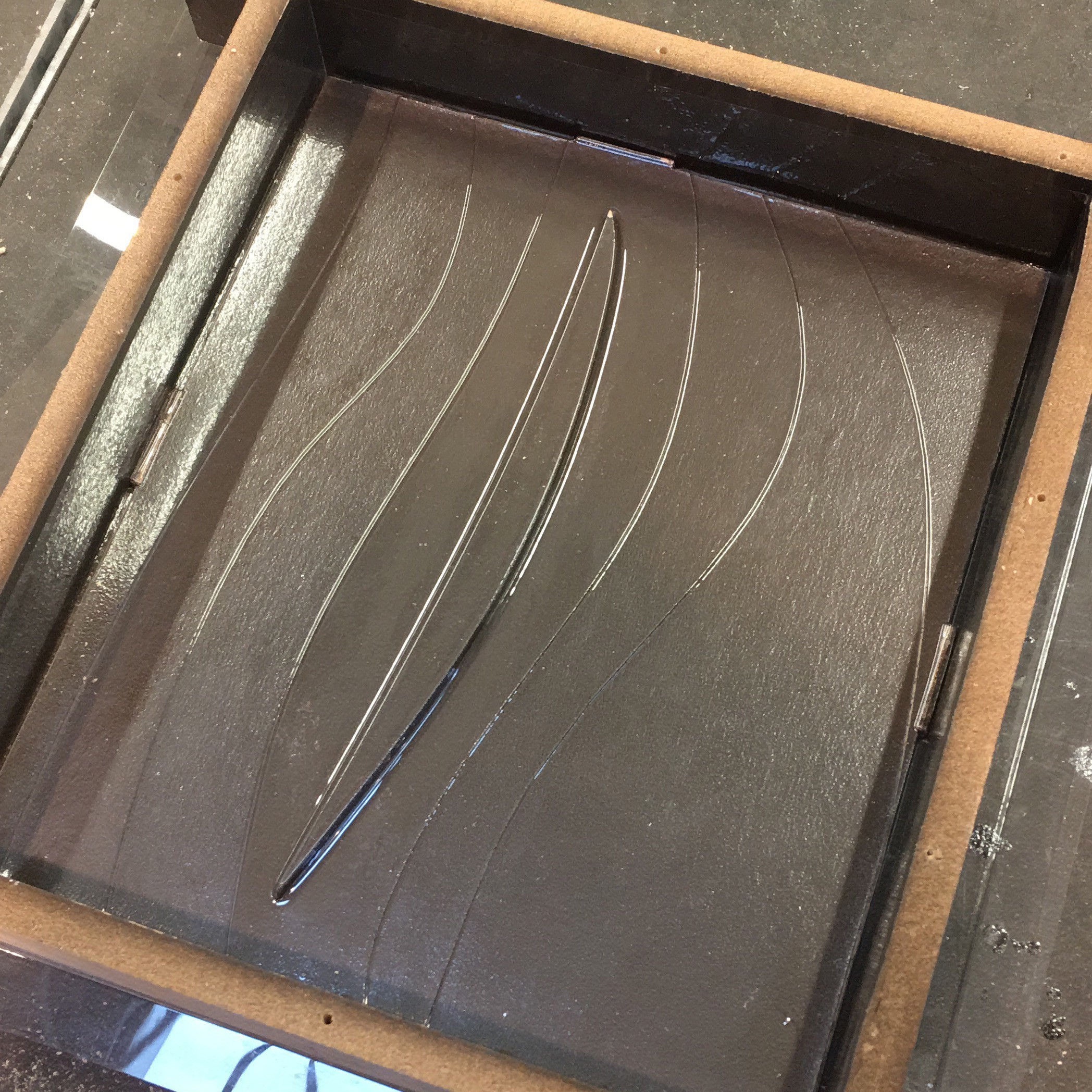
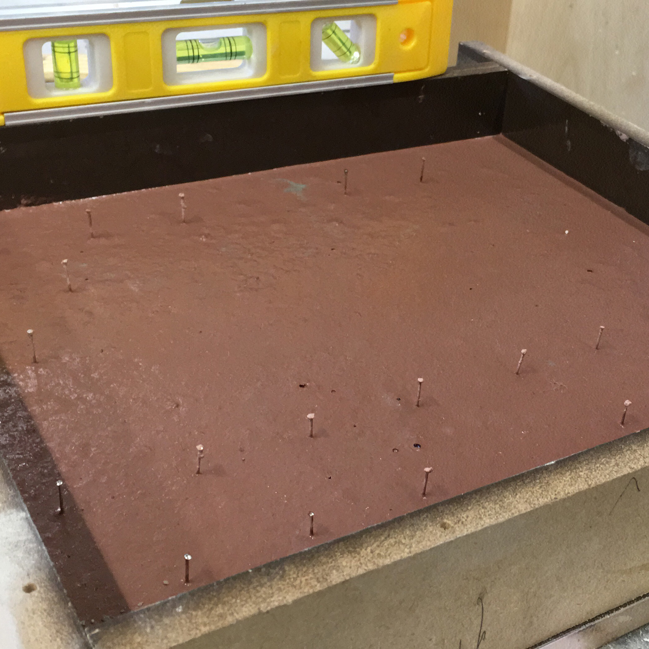
The red inner courtyard is made of concrete combined with red oxide pigment. Because it is hard to make small tests and copy the proportions exactly, I made a mould that could easily be reused. The mould was made of a laser cut in 0,4mm MDF with a layer of Vivak vacuumed on top. I sanded the Vivak to prevent the concrete of having a shiny surface. I used little nails to make holes for trees that were planted later.
For the process of pouring concrete its important to slowly add water to the cement and keep constantly mixing it. When the mixture is good (liquid, but not watery) you can add the pigment slowly and again keep mixing it. If you pour the concrete into the mould you can shake the mould (or softly tap it with a hammer) to fill the whole mold, equalize the surface and remove air bubbles. Do this again after 20 minutes or so.
In total I made three versions with three different colour tones. As advice I could say that you should not be too shy with the pigment and that the colour becomes lighter when the concrete dries.

Tactility
It was also important to show the difference between the rough landscape and the clean interior of the building. Therefore all elements of the building have been cut by a laser cutter, painted and assembled quite precise.
In contrast the landscape was mostly cut and assembled by hand. The base was of 9 mm MDF with corrugated cardboard to resemble the farmlands and a synthetic fibre mesh for the texture created by concrete tiles. I mixed the wall paint with potting soil and sand to roughen the surface. I used a round brush to dot (not stroke) to get a nice surface. Afterwards I sprayed the landscape elements with three different tones of green to create tone differences and an illusion of depth.
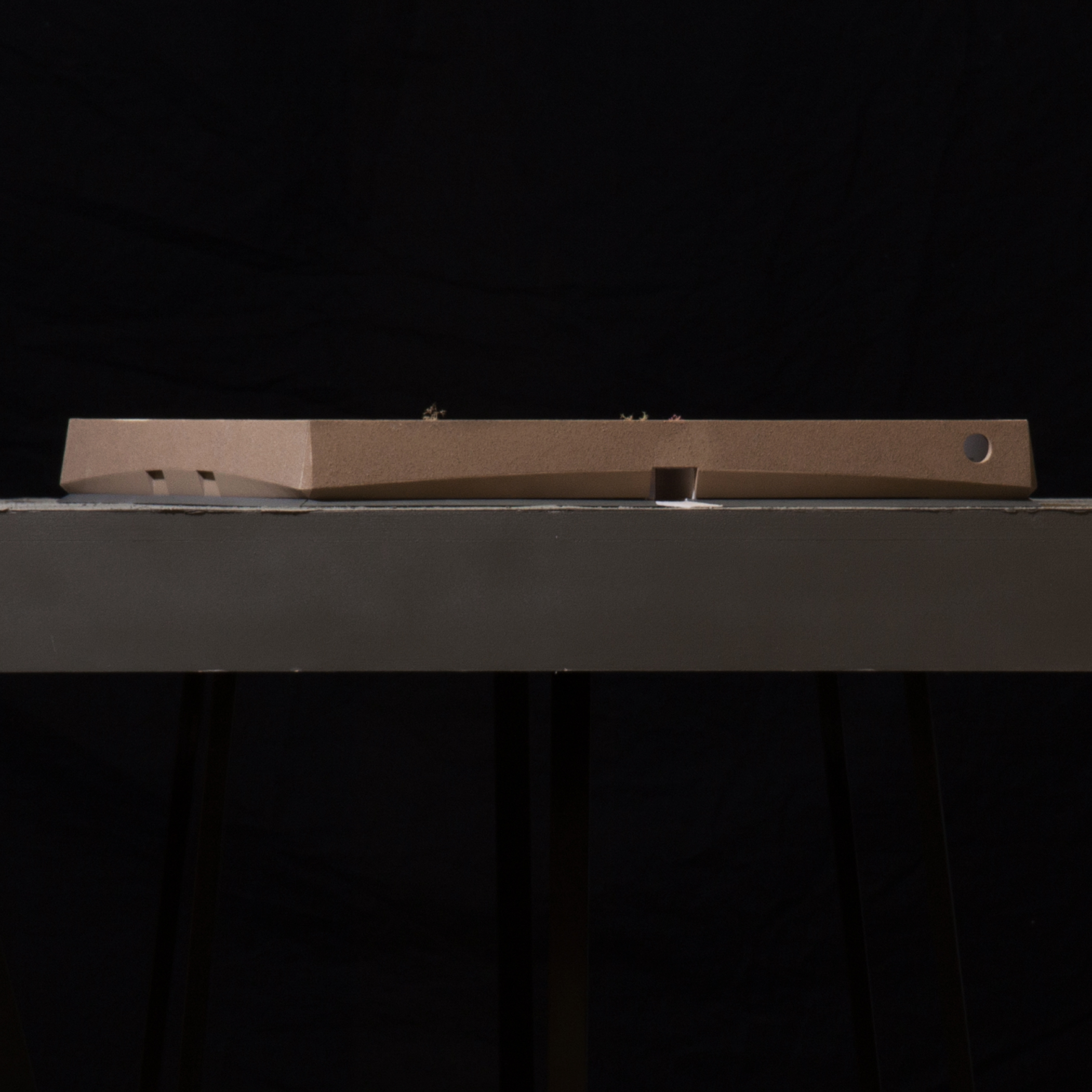
The facade was a bit tricky, because it had a curve in two directions and had multiple surface finishes. I decided to 3D print the base form of all four facades and from there treat the surfaces.
To fit the 3D printer, every facade element was printed in three loose parts. These three parts were glued together and the seams were finished with filler. Because 3D printers work in layers, the surface had a layered texture. To remove this texture, the elements were sanded multiple times and sprayed with Motip Spray-Putty. In this way slowly all ribs were filled and the surface became smooth.
However the upper part of the facade resembled reed and therefore needed a rougher surface than the lower part. Therefore I sprayed the upper part with spray-glue and afterwards lay it in a bed of fine sand. In this way you can easily add a thin layer of sand to a surface. So when the facade had the right tactility I could easily spray paint the whole facade element in the right color.
For me making this model was a nice way to experiment with different techniques, colours and textures to create various surfaces. By making quick and small tests (or take a look in the Cam-lab library) I could easily develop multiple variations. In doing so I could emphasize important aspects of my design.
Text, photos and model by Tiemen Anema